I’m so excited to show you all an actual decorating post today! It’s one I am very proud of!!
My Mom and Dad had a little problem back in August that turned into a pretty big redo. The refrigerator they had broke and needed to be replaced immediately. The problem was that the fridge was inset in the wall surrounded by cabinets on both sides and when the house was built in the early 80’s refrigerators were a lot smaller! Once I stopped by to look at the options I suggested a few more cabinet tear outs that turned into a pretty big deal! Sorry Dad!! I know it was pricey. Your welcome Mom!!
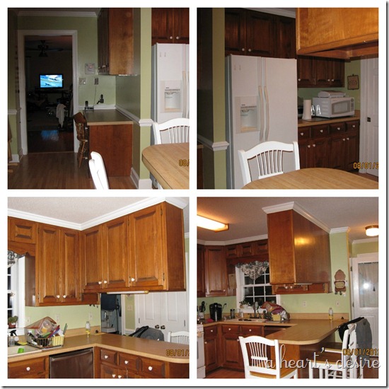
The kitchen was stuck in a bit of an 80’s time warp. Here are some of the before pictures.
You can in the top two photos how the fridge was sandwiched between cabinets on the right and a wall & desk area on the left. The easiest solution was to bump out the wall and loose the desk and cabinets on the left side and since there would demo work I suggested that the upper cabinets over the bar area be taken down to open the kitchen up. It meant losing some cabinet space, but it would make the room feel bigger. My Mom wanted to paint the cabinets anyway so now was the time.
Once they bought that I really got going and suggested that since the bar cabinets would come down pendant lights were necessary, and if you are going to add lights you should replace that fluorescent light and add a light over the sink as well. And then of course since the ceiling was a popcorn ceiling we all thought that should be scraped and repainted. Of course with all these changes new wall paint would be in order and maybe just maybe new countertops, which lead to a tile backsplash, and a new sink. It was all worth it! Check out the after photos!
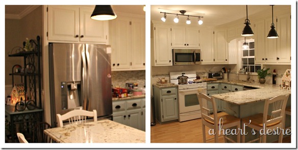
Wow! What a difference! Lighter, brighter and bigger. I love it, the colors, the tile and I really LOVE the granite. Oh and that new refrigerator is HUGE! It is truly a transformed kitchen.
My Mom and Dad did most of the painting themselves and they had some help with the cabinetry work and installation of the lighting. It was a long process but worth it, they got it all finished just before Christmas.
Take a closer look at the changes.
Over the sink the cut out at the top of the window was removed and replaced with a more modern look.
Obviously they bought a new fridge in stainless steel and added an over the stove microwave since the last one sat on the countertop, freeing more space.
New lighting to replace the fluorescent light as well as adding pendant lights over the bar and sink.
And notice that beautifully scraped ceiling…Why on earth was sprayed popcorn ceiling ever popular? Why?!?
My Mom was 100% sure about two things throughout this process. She wanted blue/aqua colored cabinets on the bottom and she loved the glass tile as soon as she saw it. Everything else took some convincing ;)
New cabinet hardware was added to match the finish on the new lights.
For the new tile backsplash this area is where they now use the coffee maker. It is a good space for a bar area, buffet, or coffee station for everyday and we wanted to do something special with the tile and show more of the glass here.
For the majority of the backsplash we used a white 3x6 with glass as the accent.
Check out that granite! It is called Vintage and it is gorgeous!
______________________________________________________________________
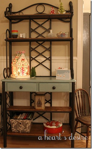
We also painted some furniture for the new space. They have a bakers rack and we thought it would look better to update it with a new coat of spray paint and some chalk paint.
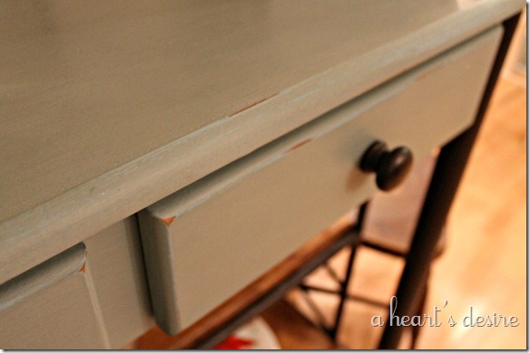
The contractor made some wood shelves to replace the glass shelves they had and we stained these a dark walnut. The paint used was ASCP in Duck Egg.
We also painted a table my Mom found at a thrift store that had been used as a work table we think, it was pretty beat up but after she applied Bondo it was ready to paint.
We used ASCP in Old White for the base and Graphite (with dark wax) for the top.
Just this past weekend she scored a deal at Marshalls on some chairs and so now the set is complete.
I didn’t really take a good picture on the before and after of the breakfast nook but it looks a lot different too. They added bead board wallpaper and chair rail molding in the whole kitchen and you can really see a big chunk in this space.
It was really fun to see my childhood kitchen change. It looks so great and I can’t wait to see all the final touches my Mom puts into it. She has some pictures to hang and is planning on new bar stools eventually but it really has come a long way! Bravo!!
Material Sources:
Lighting: Lowes Home Improvement, Allen & Roth
Cabinet Paint: Top, Behr Swiss Coffee Bottom, Benjamin Moore Gossamer Blue
Cabinet Hardware: Lowes Home Improvement, Allen & Roth
Wall Color: Benjamin Moore Bleeker Beige
Trim Paint: Behr Swiss Coffee
Bead Board Wallpaper: Lowes Home Improvement, Allen & Roth
Granite: Cosmos Granite, color Vintage
Backsplash Tile: Best Tile, 3x6 white crackle subway & Martini Glass in Matte Finish
____________________________________________________________________
How do you like these lighter colors? What have you done to update your kitchens?
April


It made me really proud to see it in pictures. What a difference. Living through it was worth it! Thank you for your help and this heartwarming post. Love u. Mom
ReplyDeleteIt looks fabulous! I'm hitting you up when I'm ready to make some changes in my kitchen (tile backsplash). I need your Best Tile expertise!
ReplyDeleteWhat a beautiful transformation. Your parents must be thrilled with the end result. Lucky to have a daughter like you to consult! Patti
ReplyDeleteAbsolutely gorgeous! I love the colors and the light fixtures!
ReplyDeleteKelly
Wow! What a difference! I love the back splash and might just have to use it in one our flips! Thanks for the inspiration!
ReplyDeleteHi April,
ReplyDeleteI am your Mom's friend, Nancy, from Georgia. Heard so much about you through the years and can hardly wait to meet you on my next trip back home to Lucama. The redo is gorgeous, Vickie is so PROUD. You guys did a wonderful job.....
Nan
I guess the house literally needed some structure updates then. Old houses are known to be sturdy, but when a problem comes along, it would need a total renovation. It's not surprising since houses before were made to last for long years. Considering the time they stand grandly, seasons passing them by, the built-in features are left behind time. Woods Custom Kitchens
ReplyDeleteThis is gorgeous! What color of the martini agate did she use? There are so many choices!
ReplyDeleteWhat a dramatic difference! The change of palettes really helped in switching from cozy to contemporary. Although it is somehow leaning towards a French rustic theme, it is still modern in every corner.
ReplyDeleteLove this! This is actually what I want to do in the fixer upper we are buying. Thank you for the inspiration!
ReplyDeleteThe floor plan of this kitchen is very similar to mine. I am considering removing cabinets over my peninsula as well, but am not sure how to regain the lost cabinet storage space. I have soffits above my cabinets, so they do not extend to the ceiling as your mom's do. What did your mom do about this? The only thing I can come up with is to put some kind of hutch in the corner, which I'm fine with, but will have to search for one at a second hand store that I can paint. Any suggestions?
ReplyDeleteBeautiful update! Where did you purchase the tile?
ReplyDeleteHi Iwoa Girl! Sorry for my late reply! I bout all the tile at Best Tile, a distributor with locations on the east coast. The glass is Lunada Bay brand and the subway is just a cream colored crackle subway tile.
DeleteBeautiful tile. Wish there was a Lunada Bay dealer near me.
ReplyDeleteWhat color did you paint the upper and lower cabinets? They are beautiful.
ReplyDeleteHi Denise, they are listed at the bottom of the post under sources. Thanks!
DeleteWe are redoing our small kitchen and I love your colors here :) Is your bottom cabinets done with chalk paint too or just straight paint?? Looks great! Thanks for adding all paint colors and details at the bottom; it just looked a bit "chalky" and I love them so thought I would ask :) Misty
ReplyDeletewhat color did you paint the ceiling ?
ReplyDeleteI am about to paint my cabinets but am debating semi-gloss and high gloss. Any suggestions?
ReplyDeletethis kitchen is soooo Gorgeous! and It is so modern and clean looking. I’m really impressed.
ReplyDeleteKitchen Cabinet Santa Fe
It looks absolutely gorgeous!!! LOve your new kitchen!
ReplyDeleteCleveland Kitchen Cabinets
you really did a beautiful job! I love how bright & fresh everything looks. What an improvement.
ReplyDeleteKitchen Cabinets Parker
There are few more important elements that contribute to the appearance and functionality of your kitchen than your cabinets. RTA Cabinet Store
ReplyDeleteThe floor design of this kitchen is fundamentally the same as mine. I am thinking about expelling cupboards over my landmass also, yet don't know how to recapture the lost bureau storage room.
ReplyDeleteZeel Kitchens
Love to read it,Waiting For More new Update and I Already Read your Recent Post its Great Thanks.
ReplyDeletetravertine floor tile
Glad I found these awesome ideas. What a dramatic difference! The change of palettes really helped in switching from cozy to contemporary. Although it is somehow leaning towards a French rustic theme, it is still modern in every corner.
ReplyDeletenice post.. thanks for sharing this post
ReplyDeletekitchen cabinet
Thank you April for posting pictures of your design. To refresh my old 1950s era kitchen, I painted the upper cabinets with BM Grand Teton White. Because my appliances are white, I thought this color on the lower cabinets would make the room too monotone. I felt overwhelmed by too many color choices so I searched online for 2 tone kitchens and found your post. I ended up using BM Smoke (similar to Gossamer Blue) since it went better with my existing floor and counter top. My husband thought I was bonkers for using 2 colors but he admitted the final product looked "OK", which is as close to a compliment as he ever gets! I used dark gray cabinet pulls and sky blue curtains. I just love it. Thanks again.
ReplyDeleteI am really impressed with your blog article, such great & useful knowledge you mentioned here.Your post is very informative. I have read all your posts and all are very informative. Thanks for sharing and keep it up like this.
ReplyDeleteContemporary kitchens
I pay a quick visit every day a few websites and sites to read content, but this web site presents quality based writing.
ReplyDeleteThis is a truly cool post. I love this kitchen. Totally the style would fit me.how to turn off clean light on mr coffee
ReplyDeleteGreat and I have a super supply: How To Properly Renovate A House house renovation tv shows
ReplyDeleteCool
ReplyDelete